Pima Logo Guide
The Pima Community College logo is the most immediate representation of the College. It is a valuable asset that must be used consistently in the proper, approved forms. The single most important element of an identity system is a distinctive logo, creating a strong visual expression of the organization it signifies.
For any questions about logo usage that is not covered in this page, please contact media@pima.edu
Preferred Logo
Download: JPG | PNG | SVG | PDF
Download: JPG | PNG | SVG | PDF
Alternate Logo
The Pima Community College logo consists of the brandtype and brandmark. The relationship (size, positioning and colors) of these elements should never be altered. Care has been taken to design a visual presentation that is simple and memorable and that communicates the spirit of Pima Community College.

According to College lore, the cross section of a saguaro cactus inspired the brandmark. The stylized letter “P,” repeated six times in a circular configuration, gives the brandmark its definition.
Also note that our logo needs breathing room. Make sure you give it some space to stand out.

Logo Variations
There are a couple of variations of our logo and there are different ways to use them.
Backgrounds
- The full color logo should always be used on a light or white background.
- The grey scale logo is to be used on light/colored backgrounds, when the logo is being used by itself without the footer lockup (college and accreditor acknowledgments section on flyers, brochures, etc.).
- Use the white logo on colored or dark backgrounds


Logo Use
The College logo always must be used on official documents and in all media.
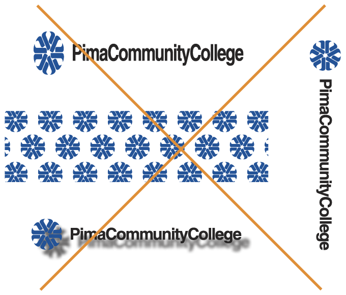
The logo is meant to be used singly, never in a series or as part of a larger design, except where approved by Media Production and Publications.
- Do not distort the logo
- Do not use the logo as decoration or pattern
- Do not use the logo behind type
- Do not use the logo with variegated shading or in a 3-D format
- Do not use the logo in an incorrect orientation.
- Do not re-create the logo
Logo with College Tagline
The College uses the Pima logo with a tagline for marketing campaigns. Some examples include bus ads, mailing pieces, billboards, etc.
For all other instances, the standard Pima logo should be used.
Brandmark Orientation
Care always should be taken to properly orient the brandmark. As seen in the “correct” version of the brandmark.

Correct (Note horizontal orientation)


Incorrect (Backwards or mirror image, image not oriented horizontally)
The brandmark should not be used without the brandtype. In situations where limited size and space will not allow for the entire logo to be displayed, such as social media icons and on various promotional items, Media Productions must approve using the brandmark without the brandtype.