Web Design System
The Office of External Relations has developed the Web Brand Guide for all public facing websites at Pima Community College to ensure design consistency and brand identity.
By following consistent standards, we exude expertise and maturity in our college and brand, creating a positive impact for our current and future students, staff, faculty, parents, stakeholders and all who experience Pima's presence.
This guide provides instructions for all website design areas. If you have questions or uncertainty about a design decision that is not listed in this guide, please reach out directly to Web Systems.
Main Design Elements
Colors
The following colors are our branded colors with supporting HEX, RGB, and HSB values.
When possible, utilize the primary color option first with the secondary as an alternative option. Use supporting colors for secondary color areas when needed.
Our color palettes should also utilize the associated text color shown when the color present is used for a background.
A prime example is Pima.edu's navigation banner being a supporting black with the supporting cyan as the font color.
Primary
- Hex: #045594
- Rgb: 4, 85, 148
- Hsb: 206° 97% 58%
Secondary
- Hex: #f7902d
- Rgb: 247, 144, 45
- Hsb: 29° 82% 97%
Supporting Cyan
- Hex: #00aeef
- Rgb: 0, 174, 239
- Hsb: 196° 100% 94%
Primary Hover
- Hex: #03406f
- Rgb: 3, 64, 111
- Hsb: 206° 97% 44%
Secondary Hover
- Hex: #ec7709
- Rgb: 236, 119, 9
- Hsb: 29° 96% 93%
Supporting Hover
- Hex: #0092c7
- Rgb: 0, 146, 199
- Hsb: 196° 100% 78%
Supporting Grey
- Hex: #808080
- Rgb: 128, 128, 128
- Hsb: 0° 0% 50%
Supporting Cool Grey
- Hex: #F2F2F2
- Rgb: 242, 242, 242
- Hsb: 0° 0% 95%
Supporting Warm Gray
- Hex: #F4F0F0
- Rgb: 244, 240, 240
- Hsb: 0° 2% 96%
Background Blue
- Hex: #E6EDF2
- Rgb: 230,237, 242
- Hsb: 205° 5% 95%
Supporting Black
- Hex: #000000
- Rgb: 0, 0, 0
- Hsb: 0° 0% 0%
Supporting Alert
- Hex: #ffd700
- Rgb: 255, 215, 0
- Hsb: 51° 100% 100%
Typefaces
Pima's primary typeface in print is Stag. This typeface is included in all of our marketing materials as the font choice for our slogan and supporting phrases.
Within our web platforms, however, we use this sparingly for legibility reasons in areas that support our brand. The Stag typeface should only be used for headlines and is always written in Title Case.
To establish Pima’s distinctive appearance on the web, we only use the typefaces listed below.
Typeface Options
The Stag typeface should only be used for headlines on the website, it also and requires a license to use. The Office of External Relations is not responsible for providing licensed typefaces. The Helvetica Neue is currently available as a free web font to use and download from Google Fonts.
Stag Bold
Font PurchasingHelvetica Neue
Font PurchasingIf access to any of these fonts is not an option, please reach out to Web Systems directly for direction on how to proceed.
Font Styling Guidelines
Below are a few guidelines for how to properly treat these fonts throughout the web platform, including header styles, weights and sizes.
Color choice for the styles are shown and alternative color options for text can be seen in the color section, listed above.
h1
Top Page Header
Font Size: 44px Font Weight: 700
h2
Supporting Page Header
Font Size: 32px Font Weight: 600
h3
Internal Content Header
Font Size: 22px Font Weight: 700
h4
Internal Content Subheader
Font Size: 19px Font Weight: 600
h5
Internal Content Subheader
Font Size: 17px Font Weight: 500
p
Body Copy
Font Size: 17px Font Weight: 400
Alt
Alternative Style A
Font Size: 25px Font Weight: 300
Alt
Alternative Style B
Font Size: 17px + Font Weight: 700
Logo Usage
The Pima Community College logo is the most immediate representation of the College. It is a valuable asset that must be used consistently in the proper, approved forms. The single most important element of a brand identity system is a distinctive logo, which creates a strong visual expression of our organization.
Within the Pima web areas, the logo currently only needs to be used appropriately in the header and footer of each page. This provides a clear understanding that the webpage is a Pima Community College entity.
For additional usage and logo guidelines within Pima Community College, inside and outside of our web presence, please visit our Logo Usage Guide.
Primary Web Logo
We utilize the full white version of the logo on the header and footer background. A clear use case is on the header itself.
Favicon
Here is an example of our favicon for Pima.edu that should be utilized throughout Pima sites.

Any other use cases of the Pima logo should be brought to the attention of the Web Systems team for proper direction.
Page Layouts
In our Pima web pages, we make plenty of use of white space between elements to allow all areas of text, imagery and graphics breathing room for our users to digest the content throughout. This also allows us to have the ability to use generous sizes, weights and colors of branded elements and graphics.
Web page layouts should always be handled via a responsive grid or flex system. Older fixed-width grids and layout methods should no longer be used since they do not display well across various screen sizes and devices.
Layout Content
Our pages are typically very consistent in our layouts to help provide familiarity when seeing new content.
Primarily, our internal content pages include a left internal page navigation, a breadcrumb area, a supporting image and a page header, followed by the associated content. Within the associated content, we allow for a thin internal right column for Important information, such as contact info or office hours or quick links to supporting items.
In higher level pages used, we forgo the left navigation as the content within these pages usually expresses the navigation for the connecting pages to follow.
Finally, all pima pages include the Pima Header and the Pima Footer as seen on this page. If you have questions or concerns about page layouts, please reach out to Web Systems for direction.
Graphic Elements
Photography
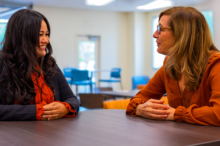
Across all PCC website pages we choose photography that is authentic, relatable, and engaging. We want to showcase a day at the College through the experience of our students, faculty and staff.
The images used on the website are chosen to create believable and encouraging experiences for our web visitors. In the brief moments that we have their attention, we want to share as much of a story as we can about the individuals being photographed.
Our photography is an ever-evolving piece of our identity that keeps pace with constantly evolving technologies. Subtly, we adjust our style to fit modern web photography while being considerate and cautious of trending temporary styles.

Subject & Subject Matter
PCC is an incredibly diverse community and we want to showcase that as often as possible. Always be considerate that we are celebrating all races, genders, age, and cultures.
We want to tell a story. Our subjects should as often as possible be in action to show a day in their life at Pima.
We also strive to showcase actual students. We want to be authentic in our storytelling and authenticity is displayed when we show real students living out their Pima story, rather than models for a shot.
Lighting & Color
Our brand welcomes warm and brightly lit images. We want to be cautious of over or undersaturation while still wanting images to look as natural as possible.
Often we take photography with natural light, outside or in warmly lit rooms. On the rare occasion that artificial lighting needs to be used in dark locations, we are strategic about the color choices and always use professional lighting rigs and equipment.

Backgrounds
Every part of the image needs to tell a story including the location of our subjects. We want clean, professional backgrounds with few distracting elements.
We often, but not always, apply a small blur to our backgrounds to help center the focus on our subject but we still want the context of the background to be clear and not too muddled.

Logos & Brands
While we may have good standing relationships with external companies or institutes, we want to avoid or remove any sort of brands or logos that aren’t a part of Pima. This allows our images to have a longer life should any relationship or company reputations change for any reason.
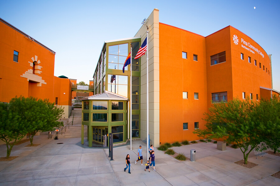
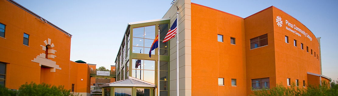
Locations
When using images to support our locations, we like photos that represent a well maintained and modern college campus. Exterior images are preferred with lots of natural color and beautiful, healthy scenery.
When possible we take wide shots of our structures in our most impactful areas of the campus. If at all possible, we want it to be during times of high traffic to show the comings and goings of Pima Life.

Equipment
Almost always, the photos we choose to display and advertise of our brand are captured with professional equipment. This includes a professional DSLR camera, appropriate lens for the shot and additional equipment when needed.
This means we stray away from using images captured on cellular devices or smaller digital cameras to uphold the raw image quality.

Stock Photos
We take all of our images in-house. However, there are times when this is not possible. In this case, Stock photo is the only option to help support our content. While these situations should be extremely rare, we always select images under our paid license through Getty Images.
Our image selection through this license are ones that are cohesive to our brand styles, straying away from trendy photo styles and typical stock poses.
If stock photography and in-house options are not available, External photo sources must be approved by Web Systems and cannot require compensation, must be copyright-free, and can not display any kind of watermarking from the image producer.
Capturing Tips
Sizing: Our photos should be flexible to be used in different areas of our sites, sometimes requiring extreme photograph dimensions. With this in mind, it is good practice to capture both in horizontal and vertical images of your subject.
It is also good practice to give space around the subject in your photo to easily allow manipulation of the photograph to fit in various places on our site.
Relationship: Through experience, our Pima Students tend to have more genuine emotion when they are comfortable with what is happening. Even as a photographer behind the camera, we strive to build a connection with the student to provide this comfort.
Distractions: We always want to be conscious of what is going on in the background to not distract our end-viewers, including people objects and decorations.
Iconography
In all of our Web platforms at Pima Community College, we utilize icons to serve multiple purposes. Adding icons draws our users attention while still conveying the same message a block of copy would. They help add cohesion in our brand and present a clear identity throughout pima products. Icons also serve as a quick recognition to our users of an intended destination or action.
With this in mind, we at Pima utilize two separate icon libraries to serve two different but cohesive purposes; our own PCC Icon Library and a free icon library from Font Awesome.
PCC Icon Library
First, We utilize a set of multicolored branded icons. These graphics are meant to be scannable and attractive. We use our branded icons to break up long blocks of text, show a point of interest or support copy sections.
Below you will find some commonly used icons throughout Pima.edu and other external locations.
FontAwesome
Second, We use the most recent free icon library from Font Awesome. This allows us to create more subtle, quick and simple directions or actions. It also allows us to be flexible within our color palette to support all of our content, no matter the branding choices that were made.
Below you will find some commonly used icons and associated styling throughout Pima.edu.
Click Action Icons
Social Media Icons
Supporting Icons
Supporting Graphics
To coincide with brand elements throughout Pima, we add supporting graphics to areas that are best suited for additional branding support.
These Supporting graphics are used sparingly and typically act as a footer support element or supporting element in images.
If there is an applicable area to add such graphics, please consult with the Web Designer at Web Systems.


Link Styles
Pima has a few different styles of links for different use cases. If you are uncertain about which use case to use, please reach out to the Web Designer at Web Systems.
Inline Links
Inline Links, like this link, should be of the primary color, #1A0DAB, with the darker hue hex color, #03406f, as a hover action. All links are currently underlined, unless in a special circumstance such as a navigation and buttons where the understanding of a the content being a link is given.
Visited links should have a hex color purple, #660099.
Block Links
Links that are outside an associated paragraph can have similar characteristics or can vary. These style examples include links that are in lists, side columns and navigation areas. This does not include links that have been stylized as a button.
Buttons
On some occasions, a button is a better alternative to a link. It provides a clear call-to-action the user can access with little thought.
All buttons on our web platforms share similar styles in sizing with color adjustments, as seen in the list featured. The codes for the button, text and hover colors for the button examples below that can be found in the color section above.
Button CSS Styles
border: 1px solid button color
margin-bottom: 16px;
padding: 9.6px 12px;
width: 230px;
Primary Button Options
Secondary Button Options
Breadcrumbs
As a form of quick navigation and page location, Pima.edu has a linked quick navigation trail referred to as "breadcrumbs". This is a necessary piece of navigation that can help convey the information architecture and should be added in appropriate areas if possible.
Below is an example of Pima's standard for our breadcrumbs.
Call Out Styles
Throughout many pages on our web platforms at the College, content areas are separated by stylized areas called call outs. The purpose of these call outs is to bring attention to important information or associated content.
Below are a few examples of how these call out areas should be stylized to stay within the Pima brand identity
Call Out Header
This is a call out example.
Call Out Header
This is a call out example.
Blockquotes & Stats
To support long areas of content, it is good to call out important pieces of information and engaging quotes. These styles usually float to the side of the content (except on mobile devices). Below you will see a few examples of how we style this to fit in our brand parameters.
"I trust that the education I receive through Pima for this program will again allow me to reach my goals."
35% higher average weekly earnings*